2021 Brand Refresh Senior Staff Illustrator
Lyft
After 3+ years working in-house, I took another pass at refreshing the Lyft Illustration style. Even though I loved the style we’d built up, I was definitely ready for a change.
The goal this time was to mature the brand, bringing confidence without loosing the heart associated with the brand.
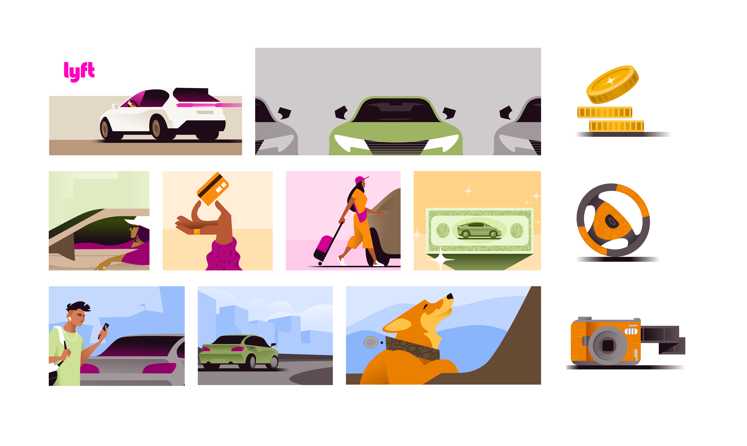
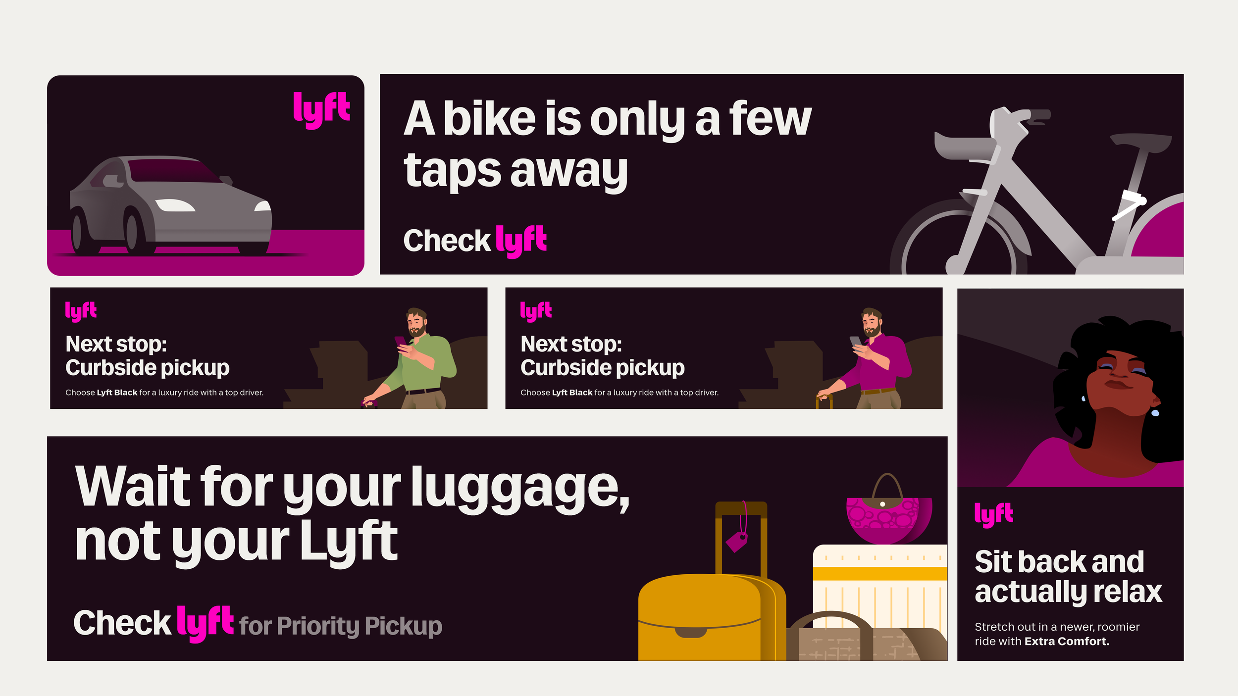
We started with a more sophisticated color palette, using tints, shades and neutrals to balance Lyft’s updated secondary color palette. Combining this color nuance with minimal gradients allowed for greater detail and elevated style points.
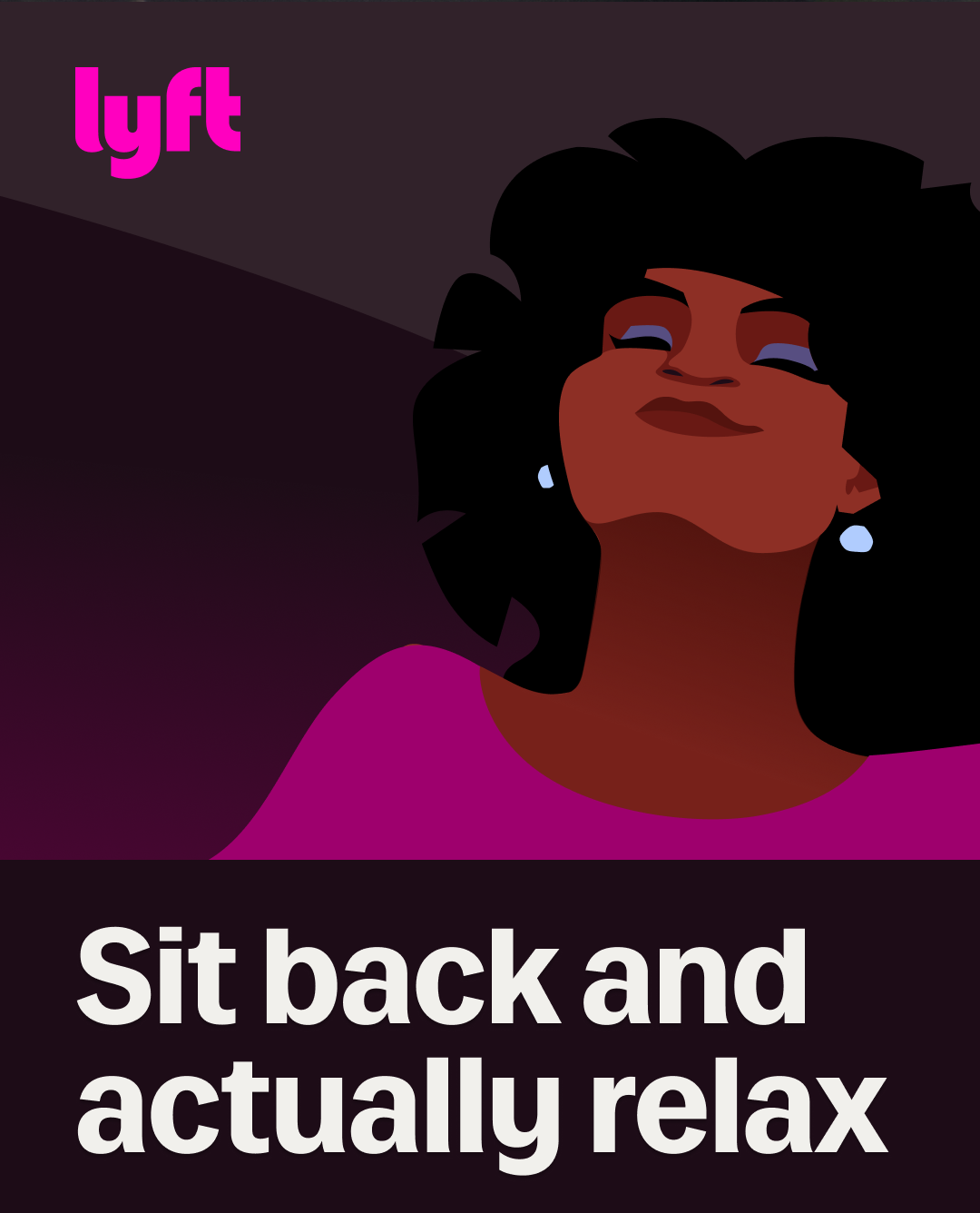
The forms used to build our illustrations mimic the rest of the brand ID. Graphic flares similar to those in the new Rebel Sans typeface are used in details like this woman’s hair. Overall we are now balancing clean, geometric edges with stylized curves similar to the update in the Lyft logo. The new logo is cleaner with clarified baseline but the most iconic part of the logo, the Y, remains untouched.
There’s a lot more to say and show about the style, but I’m neck deep in the rollout right now. More to come.


