Lyft 2021 Rebrand Staff Illustrator
Lyft
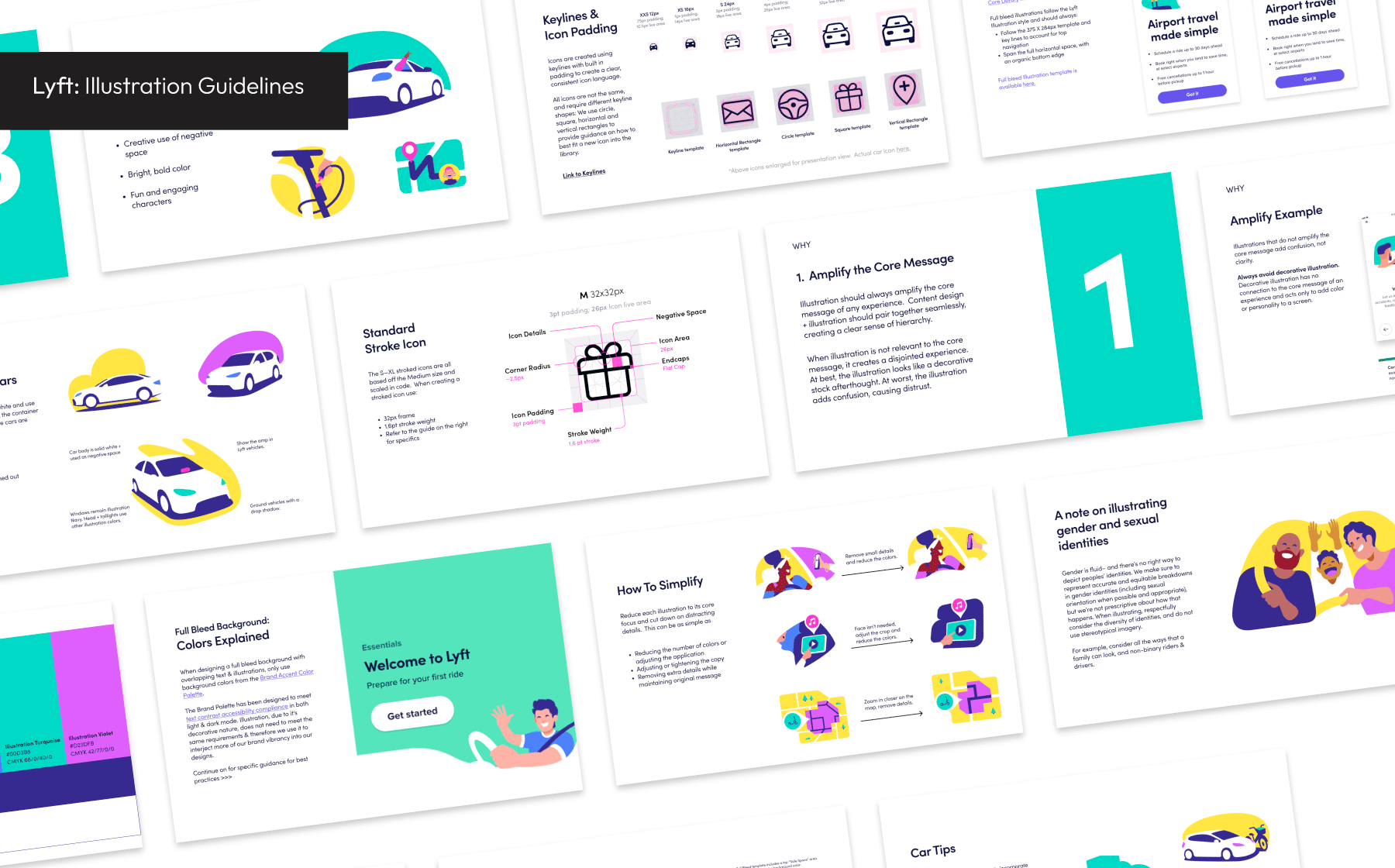
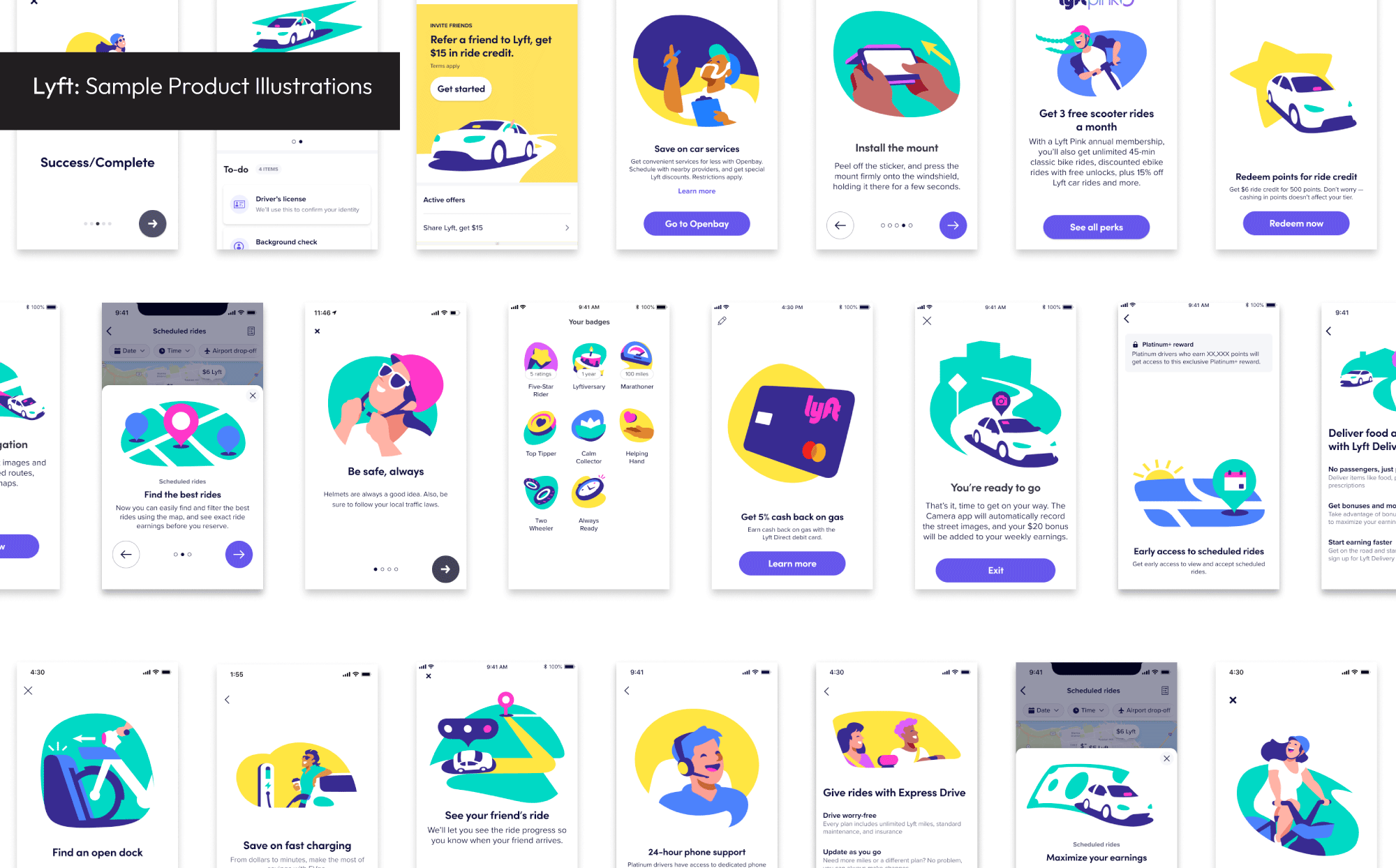
I joined Lyft’s product illustration team during the 2021 rebrand. By this time, the product had taken on a serious, muted tone that was at odds with Lyft’s rebellious playful spirit.
The goal was to recapture the “Lyft wink” and at a systems level we emphasized simplicity humanity, and whitespace across the app. Going back to these principles reconnected the product experience with the brand’s public perception, unifying the Lyft brand. Not long after the rollout the strength of Lyft’s brand was highlighted by Fast Company.
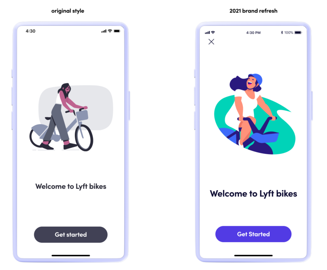
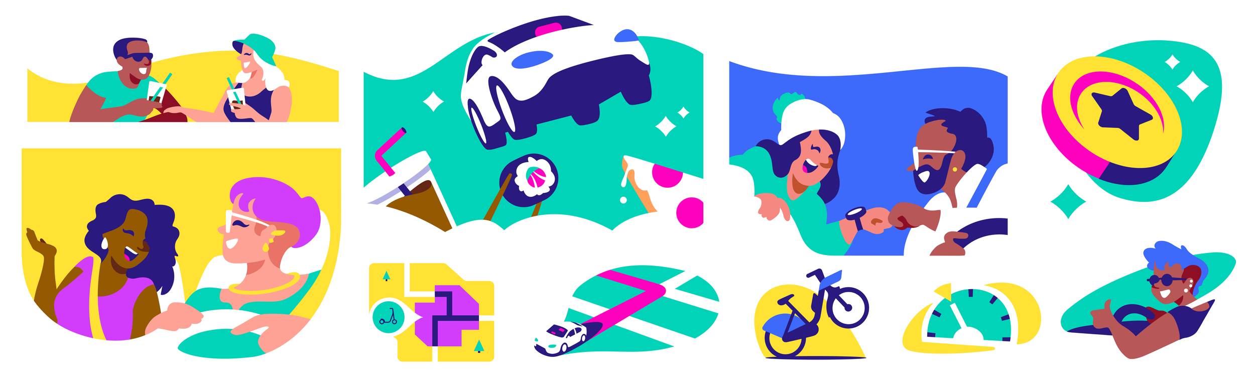
The illustration style reinforced these principles by utilizing a restricted set of bold colors, organic shapes and individualized characters. Integrating negative space as a key style point was a huge unlock for the team. This allowed us to integrate the illustrations more easily into new airy UI.
This whitespace and more importantly our white vehicles provided stark contrast to our main competitor, Uber, who is more synonymous with the color black. Taking a cue from old Westerns, white hats are the heroes and black hats are the villains.
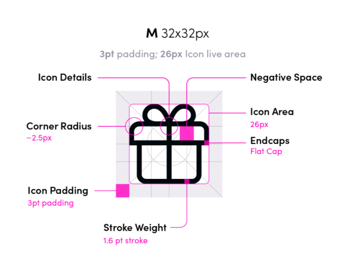
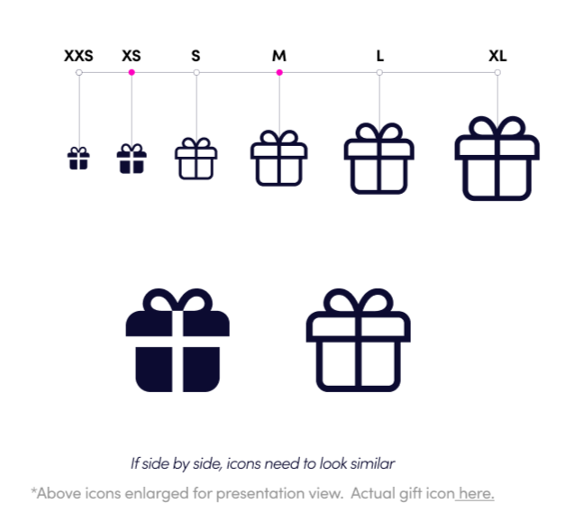
Iconography:
The iconography style development reinforced the systems changes by shifting from a blocky style that mirrored street signs to a more elegant stroked icon style. The mix of curves and blocked end caps are friendly without being juvenile. Sorting out the iconography was a super technical and complex problem that was fun to untangle… but it’s not very fun to write about so. That’s probably enough.
Rolling the style out across the organization, creating guidelines and shepherding it through several years of organizational changes was a true education on how early creative decisions scale and how some things come back to haunt you.